Since it’s Spooky Season, I thought what better to blog about than some of the most horrifying kitchen design mistakes I’ve run across. Hopefully these mishaps will help you avoid experiencing these nightmare scenarios.
Little Kitchen of Horrors:
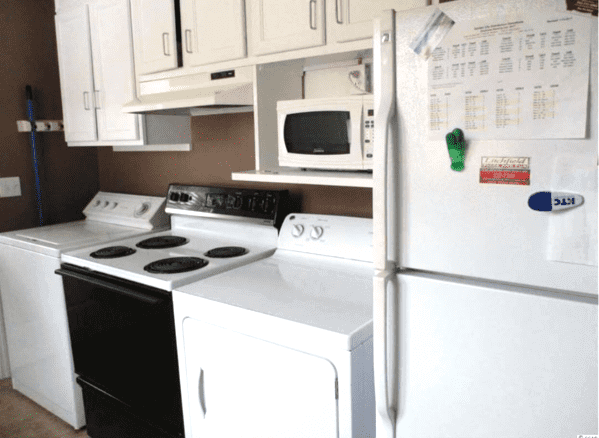
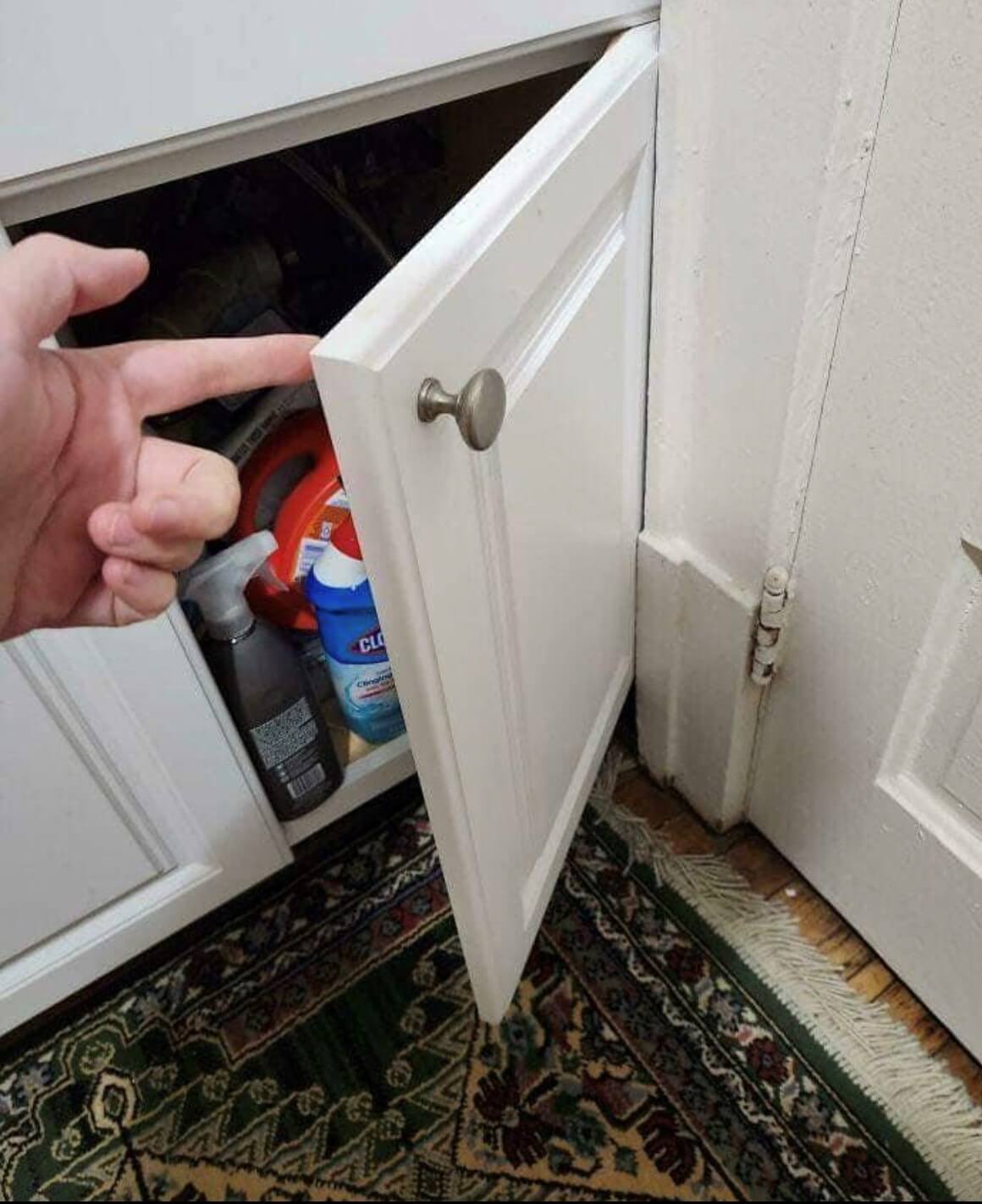
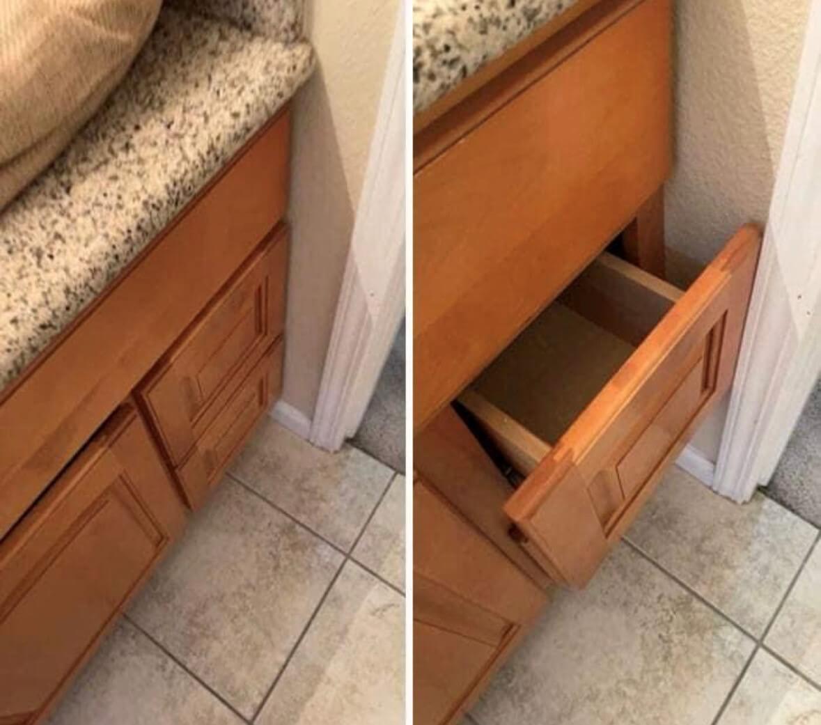
Granted this is one of the worst offenders I ran across during my research, it does address a common mistake, packing in too much multi-tasking in one space. The best design has a balance between form and function. This is an example of WAY to much function.
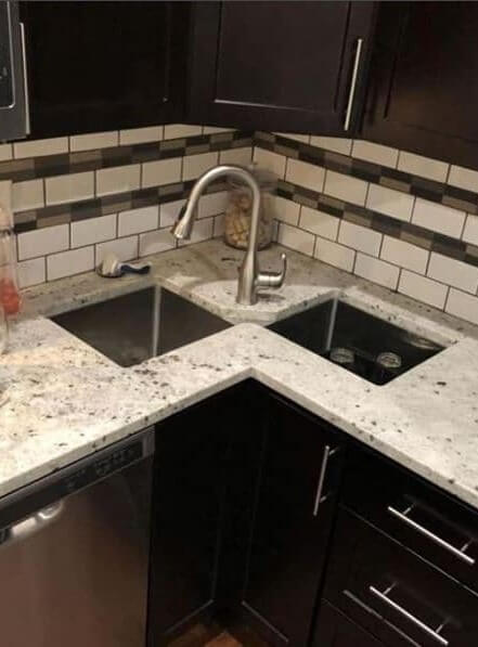
Nightmare on (2 perpendicular) Streets:
Corners can be tricky, but they don’t need to be crazy town.
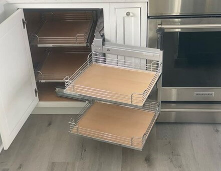
Below is a more common mistake involving a blind corner cabinet with swing out shelves. In order to swivel out the second set of shelves, the 1st set needs to be pulled out entirely (at a 90 degree angle). That can never happen here unfortunately.
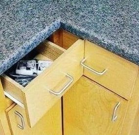
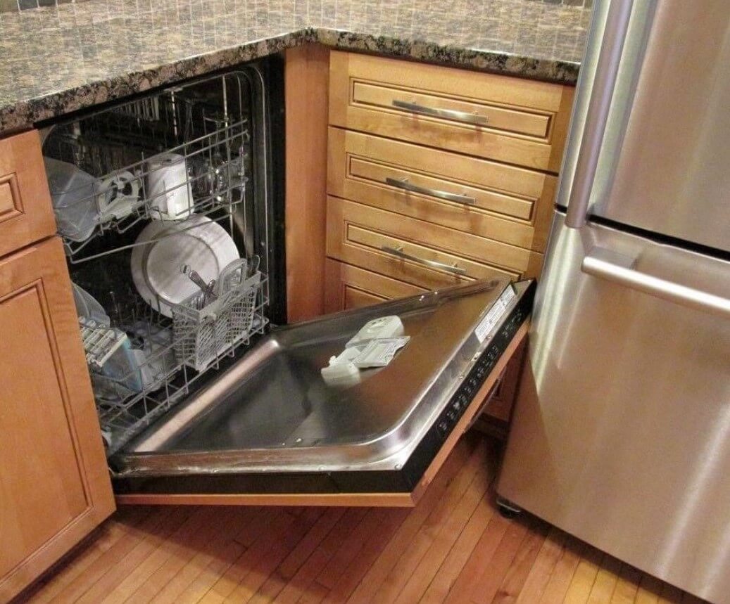
A corner snafu that is all too common is the hardware collision of drawers at 90 degree angles.
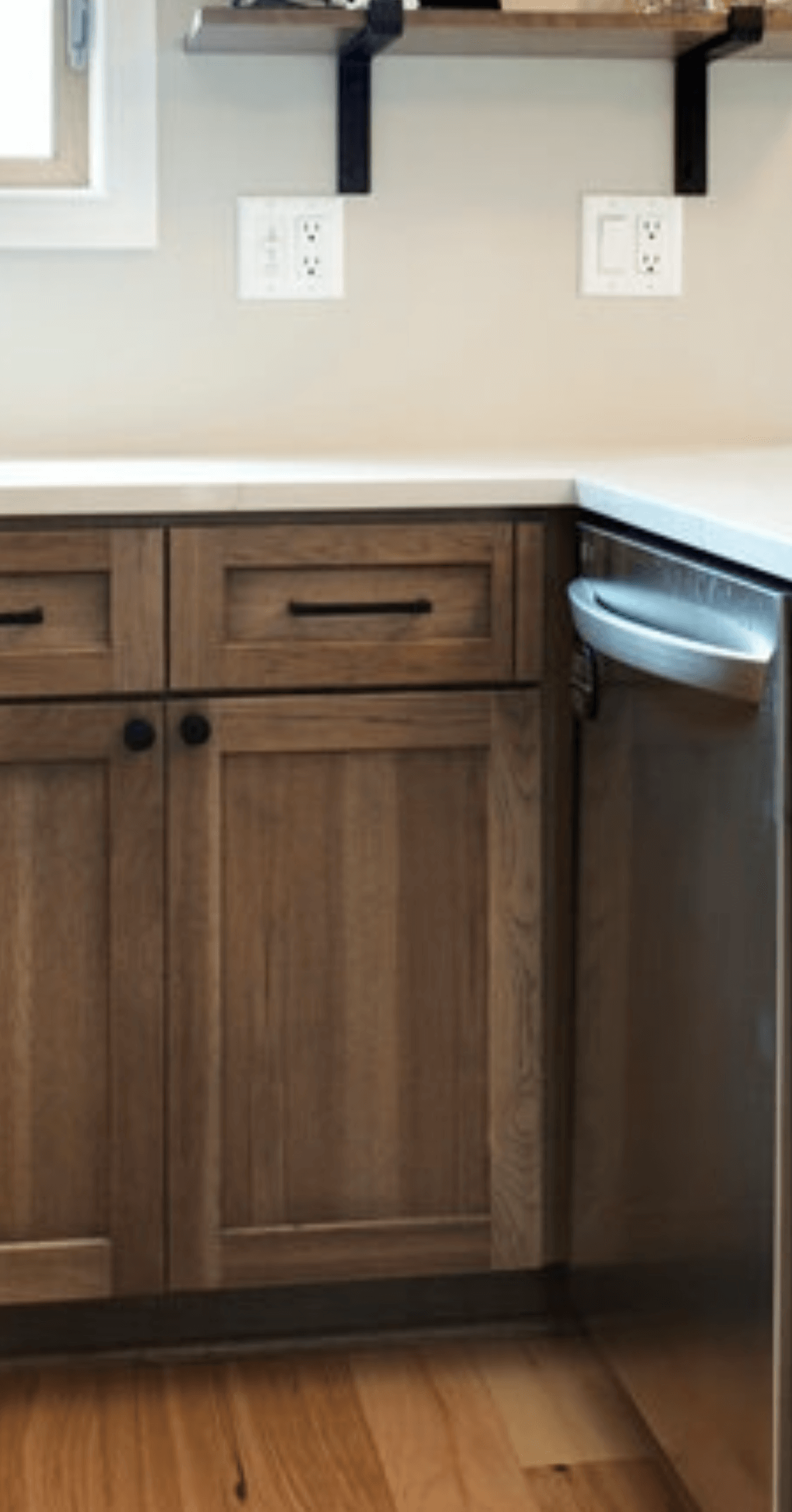
This can also include cabinet hardware vs appliance handle:
All three of the above could be easily remedied by sufficient fillers or extended stiles.
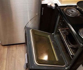
Heeere’s Johnny! (and he can’t open the range):
Oftentimes appliances can cause a domino effect of problems for a designer.
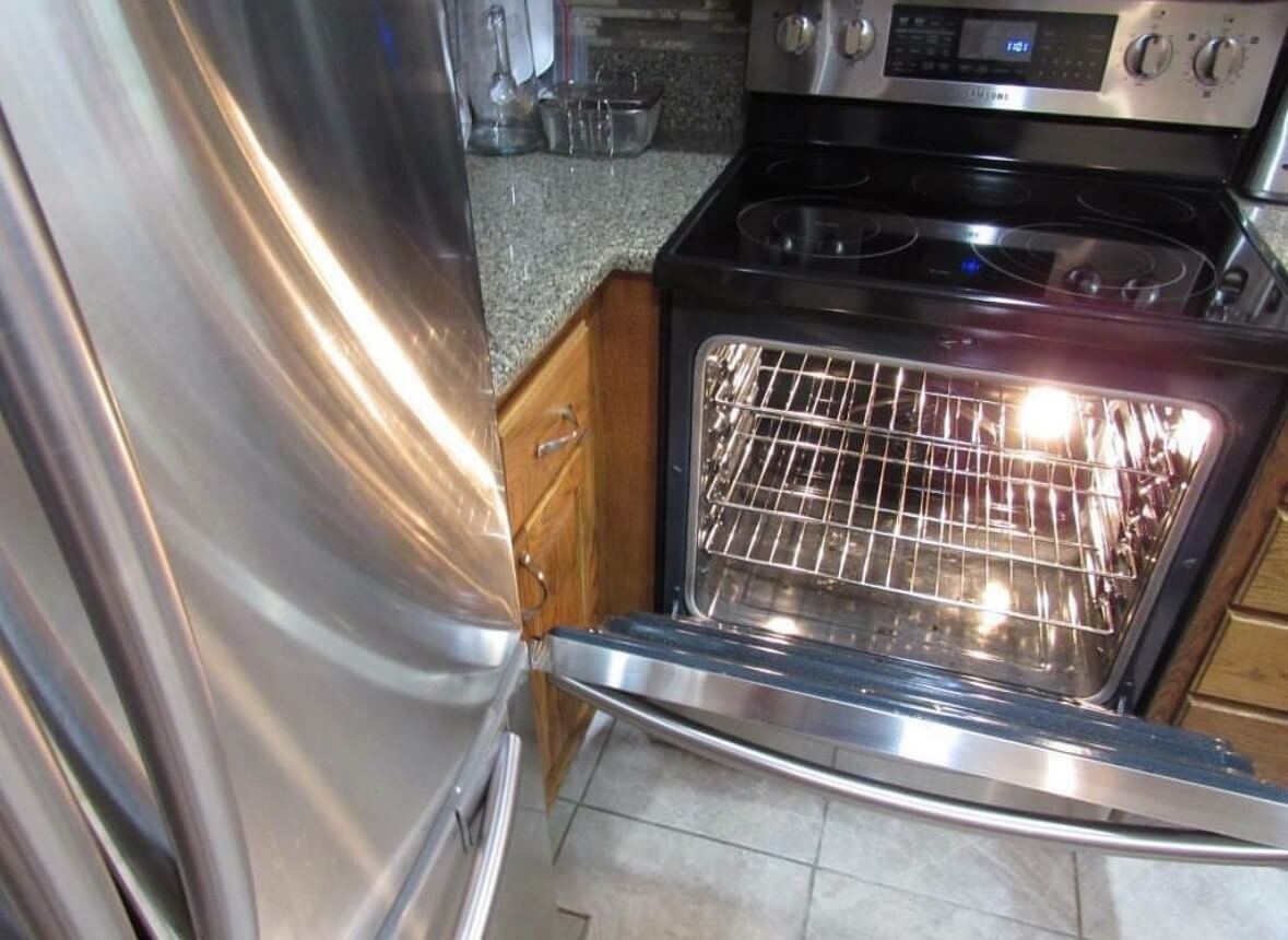
Below, the range is so close that it’s actually scratching the finish on the fridge.
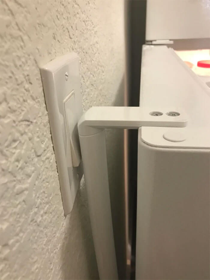
Below, for some reason this kitchen goes dark every time the refrigerator light goes on, hmmm…
You should always be able to open any appliance fully at any time.
All of the above appliance collisions could have been averted by careful attention to the details in the appliance specifications. For this reason I will never order cabinetry for a kitchen I am designing unless I have the exact make/model of every single appliance beforehand.
The Devil is in the Details:
Height and depth variations throughout a design can wreak havoc if not paid close attention to.
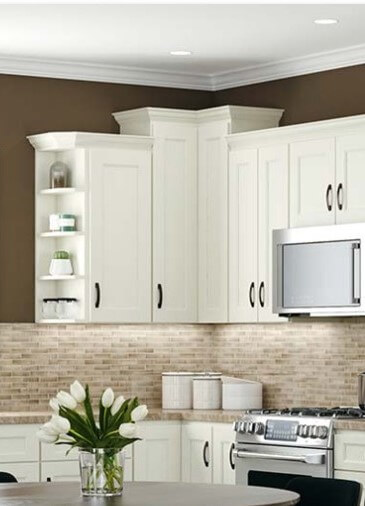
In the above photo the corner cabinet is taller that those that flank it. As a result, the crown on the shorter cabinets will, over time, dent and mar the door of the taller cabinet every time it gets opened. Also- who wants to see the unterminated, potentially raw edge of the lower crown? The easy solution here would be to make the taller cabinet deeper in order to capture the edges of the lower crown.
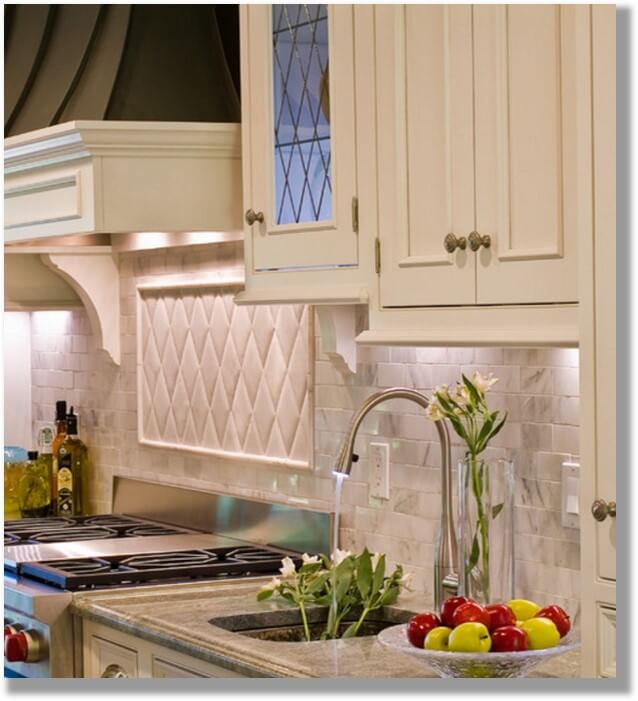
Below, another height variation, but this time we are looking at the light rail molding at the bottom of the cabinet. The molding on the bottom of the left cabinet has nothing to die into. The remedy here would be to vary the depth of one of these wall cabinets so that that molding isn’t just hanging out there.
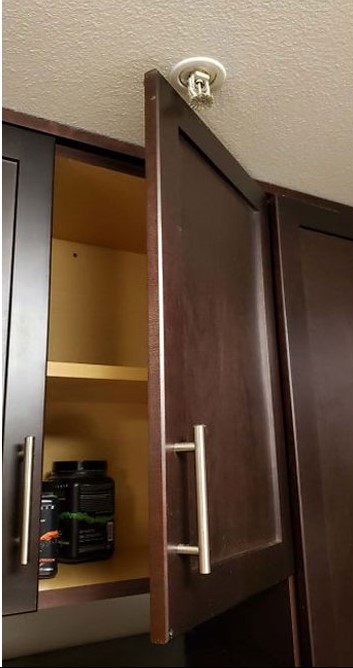
Besides corner hardware, appliance swings, and molding, other clearance problems can arise from architectural pieces. Below we see a sprinkler head that wasn’t taken into consideration in cabinetry planning. Arranging cabinetry to have a hinge line up with this sprinkler would’ve been a better move (if the sprinkler can’t be moved).
And we can’t forget casing- casing around doors, windows and openings. It seems so minor, but an inch or two here and there, and you have a non-functioning door or drawer.
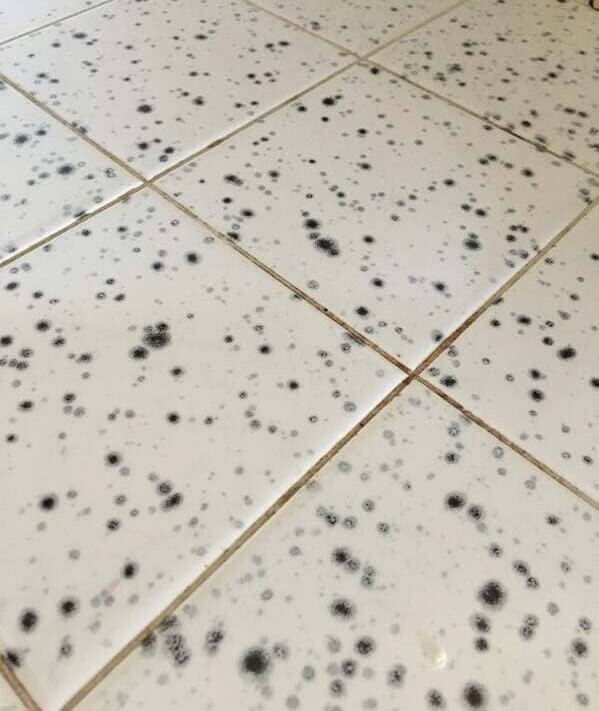
Finally, this may go without saying, but please don’t choose tile that mimics mold spores. Seriously…
I hope I haven’t scared you too much on this spookiest of days! Go forth with all of these horrors filed away in your What Not To Do folder, and create some beautiful AND functional kitchens!

