Today we will dive into the details of a model home designed for a brand-new subdivision in Indiana. Designing without a specific homeowner in the mix uses a different thought process. We spoke with the designer, Kayla Stuart, of Granite Ridge Builders in Fort Wayne, Indiana, and asked her some questions about her design process, and how she approached this project.
“Without an actual client, it was both fun and challenging. I had a creative clean slate. My only constraints were to design within the builder’s specified budget and to appeal to 90% of the public’s tastes.”
That can be harder than one might think. Kayla added, “The biggest pressure was to appeal to a wide audience. I had to make sure the style was flexible and not too specific, and the design also needed to catch buyers’ attention to help the new sub-division stand out from neighboring communities.” This balancing act between grabbing visual attention, yet being non-specific can be tricky. This naturally brings forth the discussion on form vs. function.
Form vs. Function
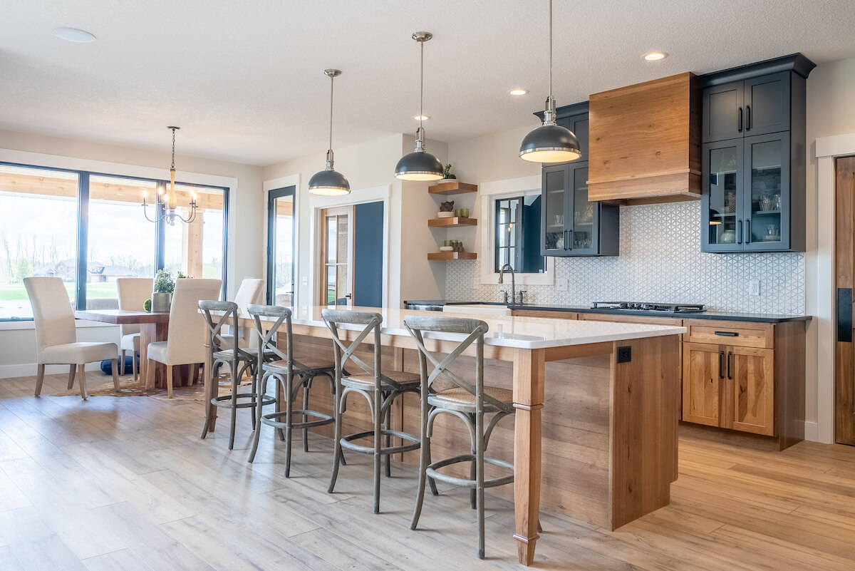
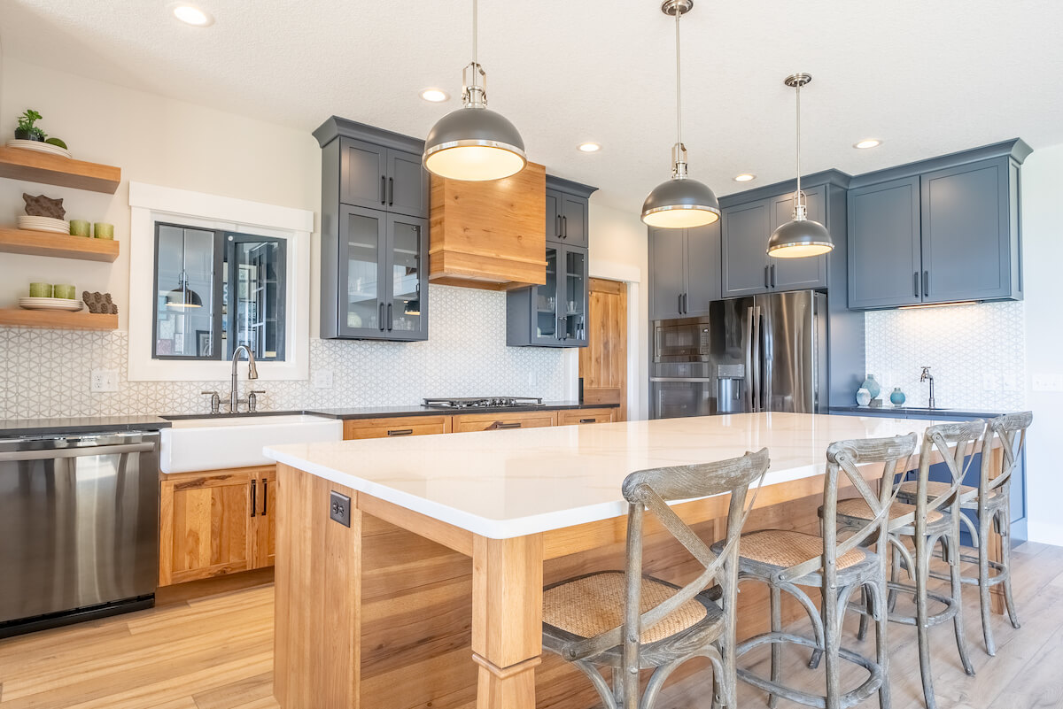
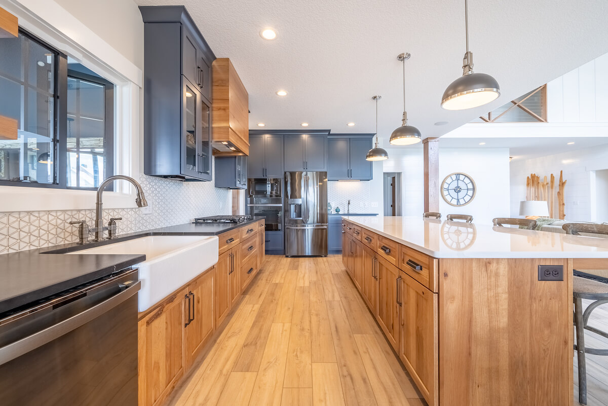
We asked Kayla to describe her design process. Since there were no homeowners with specific functional needs, she started with form, such as flooring samples, backsplash tile, cabinet styles/finishes, etc. She described the style as leaning towards Rustic Farmhouse/Industrial. Once the look was ironed out, she dove into the functionality, adding key features and specialty items.
When designing for a specific homeowner, many times functional needs may be addressed prior to tackling the form, or the “look”, the reason being generally a homeowner looks to remodel or build new to gain functionality. In a spec home, the builder must first draw in the customer with the beauty, and later, the functionality is addressed within the cabinets to meet the needs of the buyer.
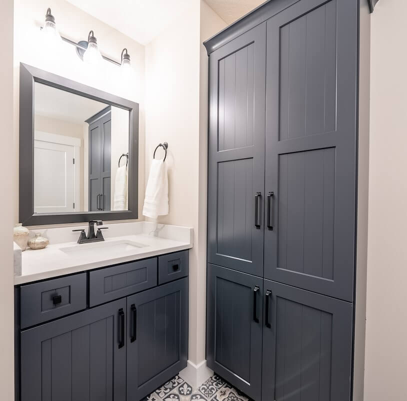
Great linen cabinet storage in this bathroom. Dura Supreme cabinetry, Carson V-Groove door style painted in Curated Color Cyberspace.
Favorite Feature
We also asked designer Kayla what some of her favorite features are in this kitchen. Unequivocally, she said, “I love the 10 ft. island without a sink. I find that in my personal home, the sink gets in the way of an island being a flowing work zone. To have one huge one-level countertop, in my opinion, is SO functional. I thought this would be important to consider when deciding what might be most appealing and eye-catching to a new home buyer.”
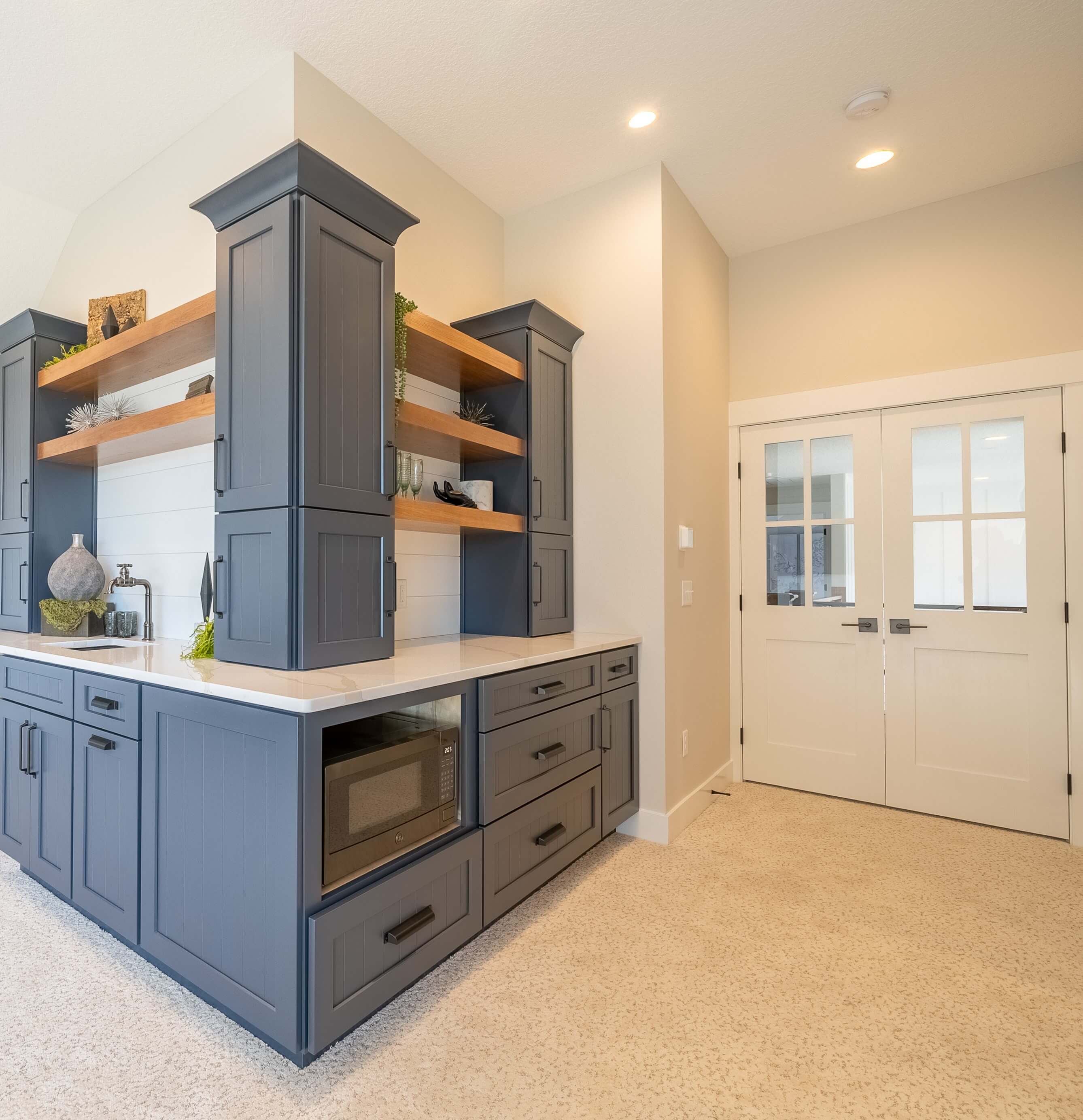
Another area Kayla loved designing was the upstairs media room, AKA the Texas Basement. “It’s a reverse L-shaped wet bar. You walk in and see the 5 televisions, and there’s a great focal point next to the cabinets. It makes for a very inviting space. Entering, you can’t help but think- wow this is a really fun, cool area!”
Challenges
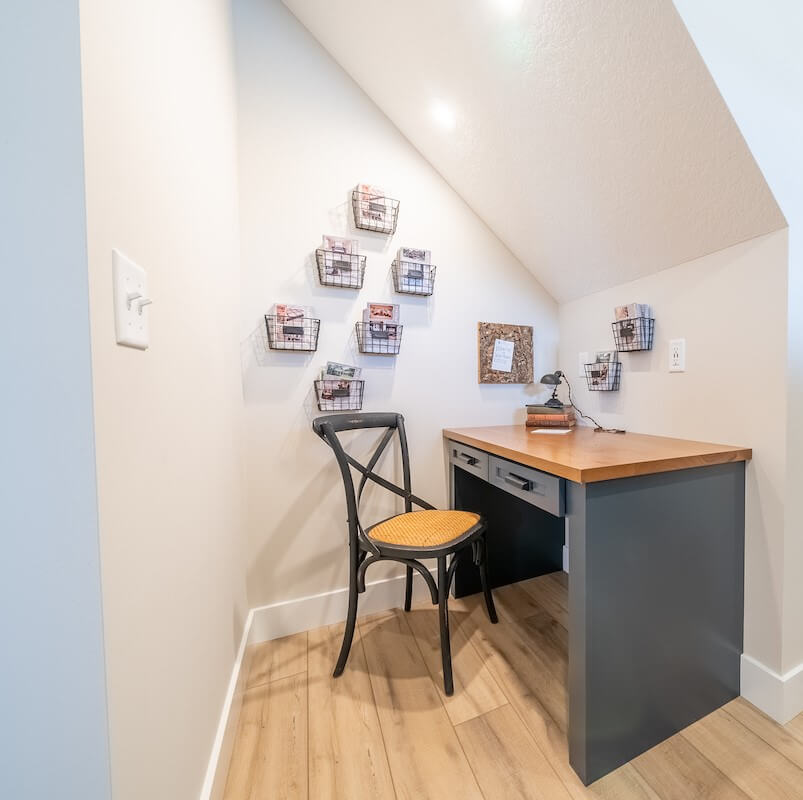
When asked what was one of the harder challenges of the project, Kayla identified the nook under the stairway. “We had to make sure we met code, figure out how to do the lighting, and do it well… It was fun designing an area that is typically wasted space under the stairs and making it function.”
Creative use of space under a stairway as a study/office nook. This home office nook features Dura Supreme cabinetry in the Hudson door style painted in Curated Color Cyberspace.
Final Thoughts
Kayla and her firm, Granite Ridge Builders, have been inspired by the very positive feedback they’ve been receiving on this home. “This is one of the most exciting jobs we’ve worked on in our 20 years of business. It has been a great way to showcase all that the new neighborhood has to offer, and has also been an inspiration for other new build jobs that have come in.”

