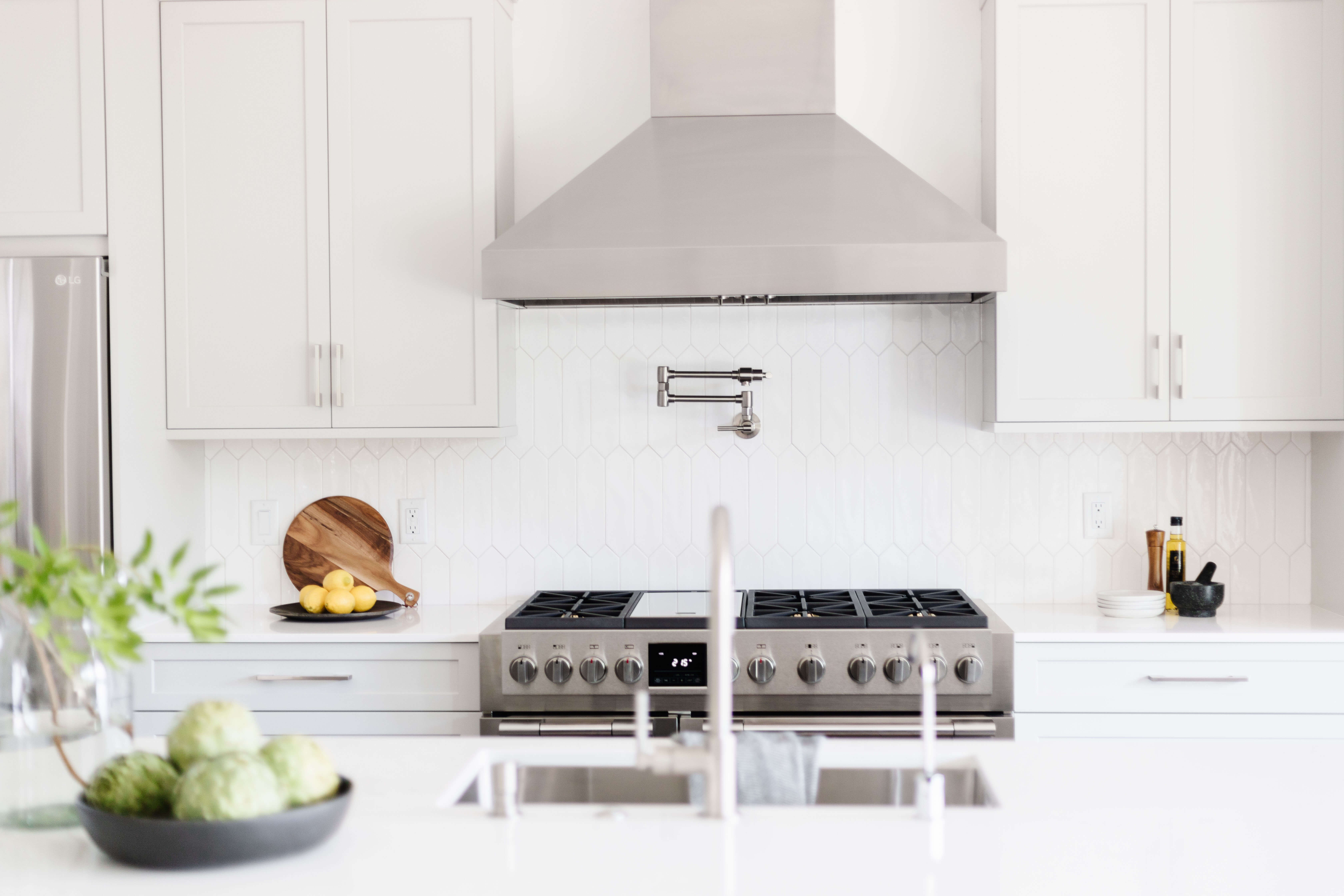
After seeing two of their neighbors’ homes completely remodeled with Dura Supreme Cabinetry by the pros at Splendid Home Designs, the homeowners wished for the same transformation in their home. They knew immediately they wanted Dura Supreme cabinets and knew they could count on the expertise of designer Bianca Fathauer at Splendid Home Designs in Stuart, Florida but they didn’t want to copy their neighbors’ style. The homeowners wanted their kitchen and master bath designs personalized to fit their lifestyle and capture their love for Mid-Century Modern style.
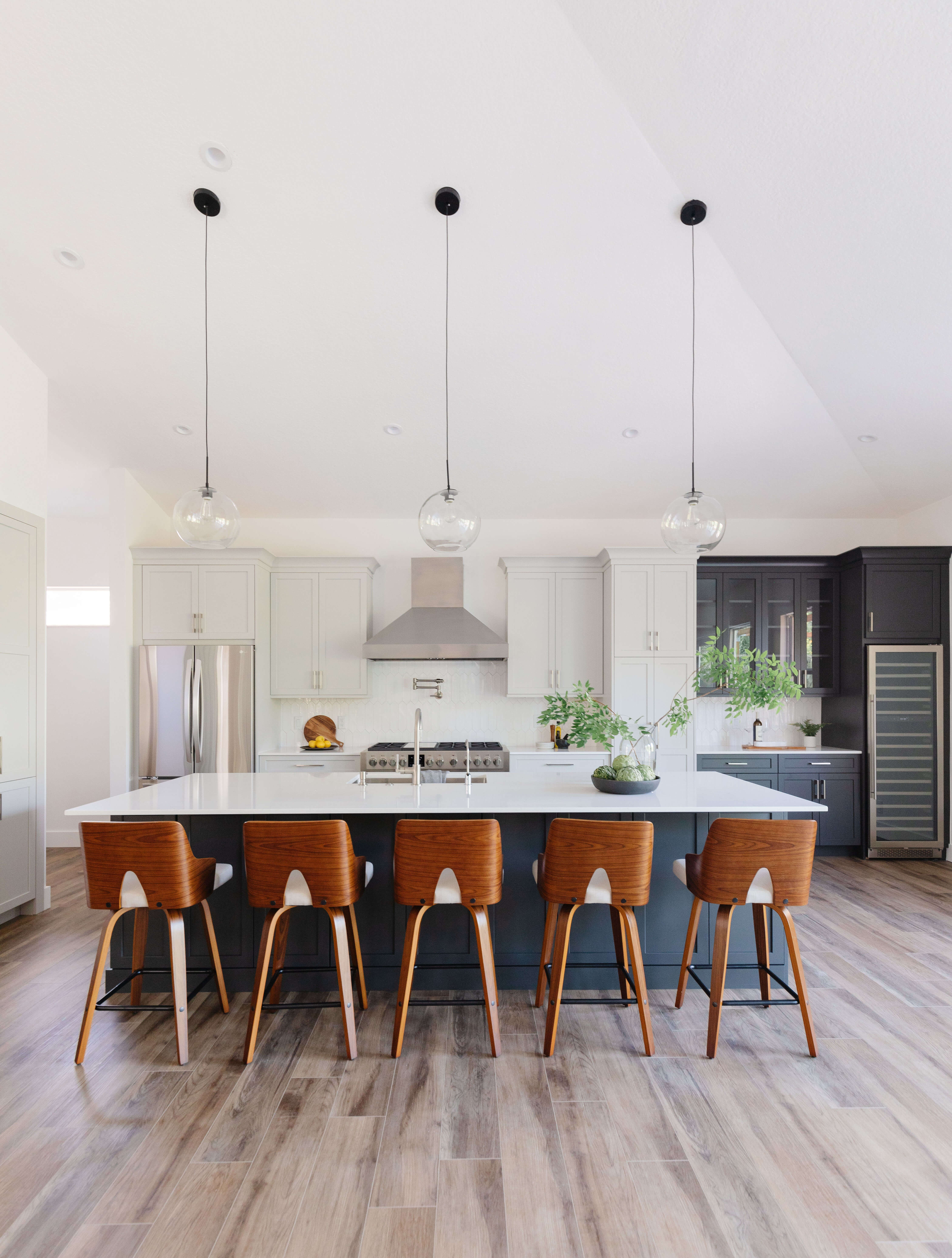
Black & White Mid-Century Modern Kitchen Design
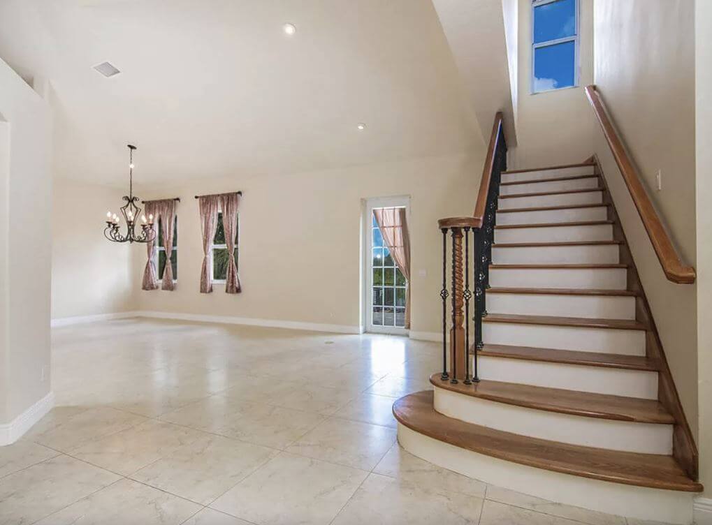
The old kitchen was very traditional looking and did not fit the homeowner’s style and felt dark as it lacked natural light being in the center of the home. It also had many walls that created a traffic flow that drove the couple crazy, they felt like they were always walking in circles. When they entertained guests, it became even more of a conundrum. They wanted a kitchen floor plan that was open, less restricting, bright, modern, and practical for entertaining.
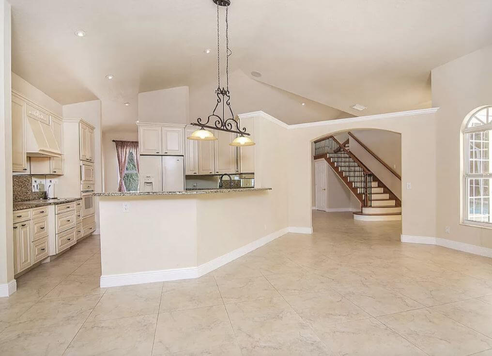
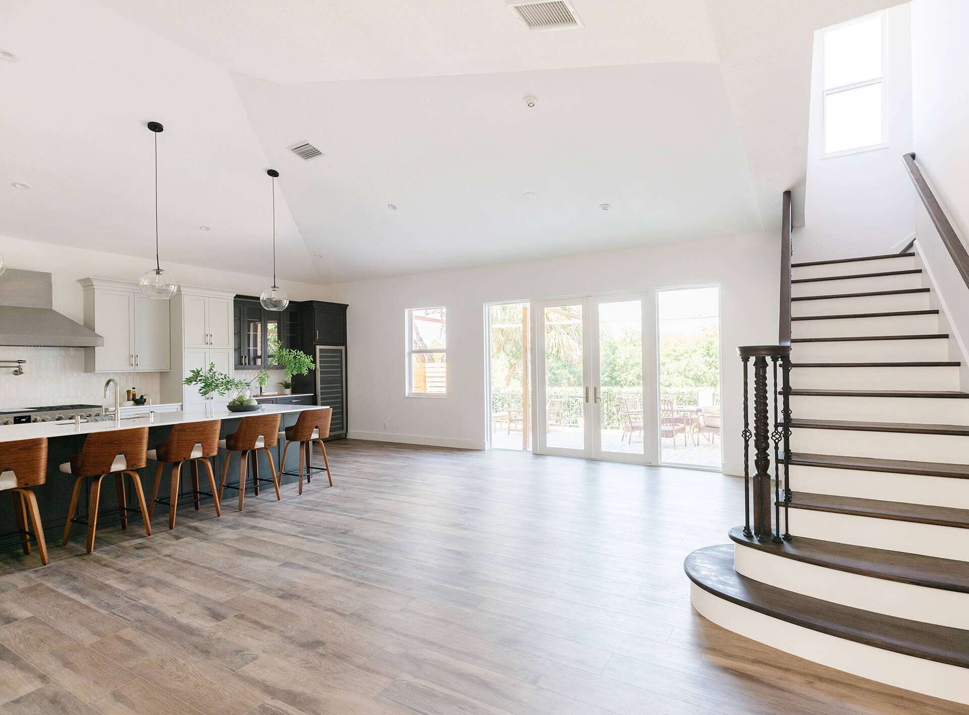
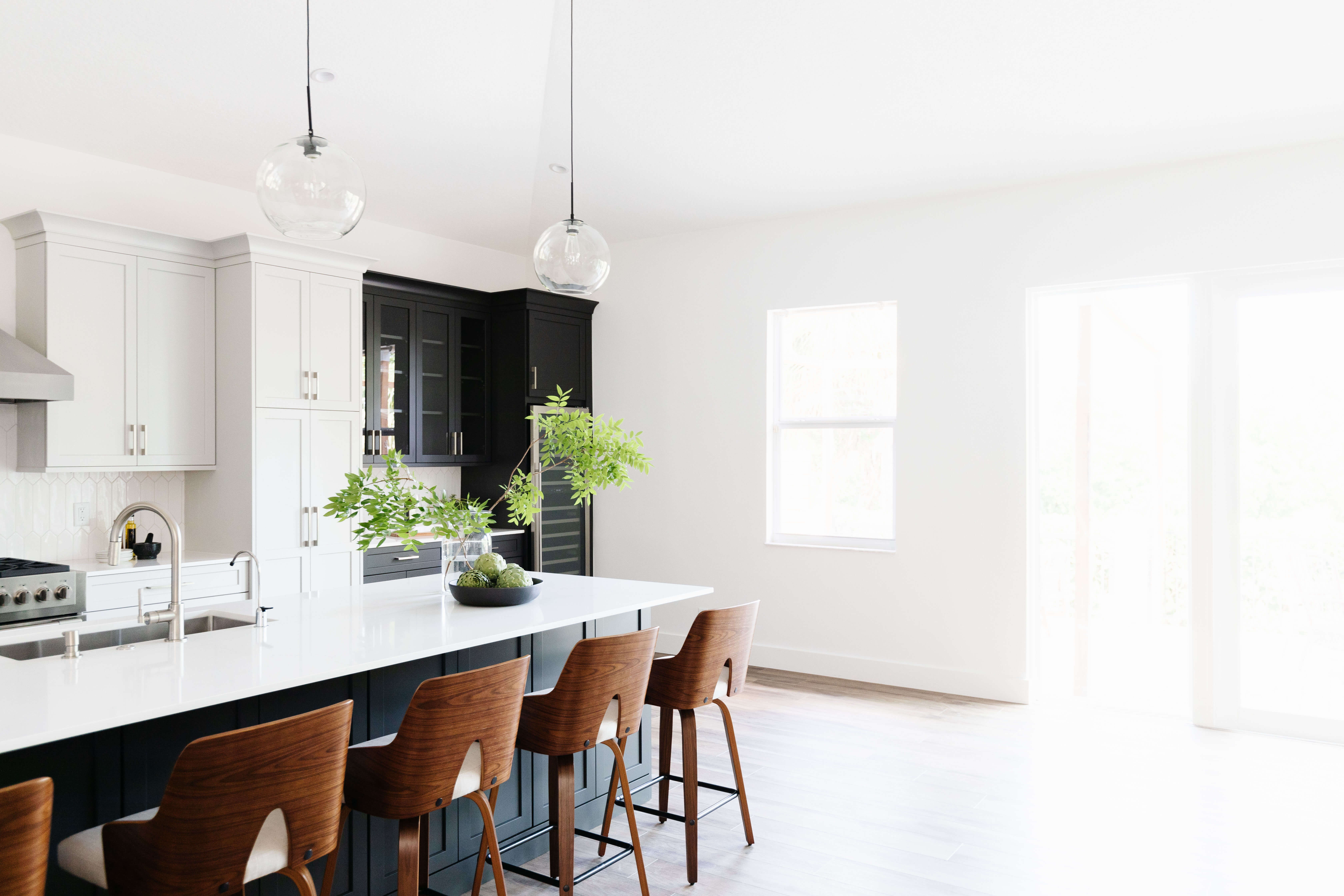
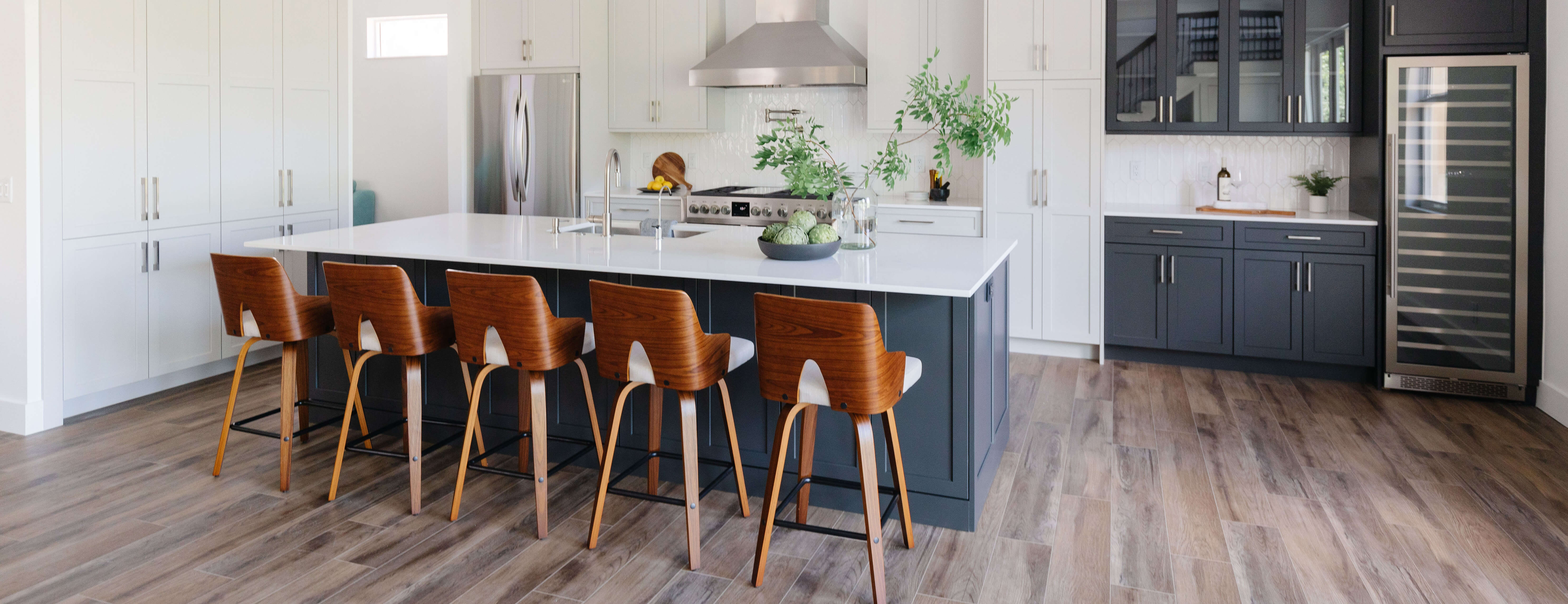
“We moved the kitchen towards the back of the home into the old dining room space where there was more natural lighting and added 12 foot long set of French doors to expand the view of the backyard and deliver more natural light,” explained designer Bianca, “Then we removed the many walls enclosing the existing kitchen and reconfigured the space to make more sense.”
“I love this kitchen for so many reasons. It’s unpretentious, hardworking, and eager to serve,” expressed Bianca.
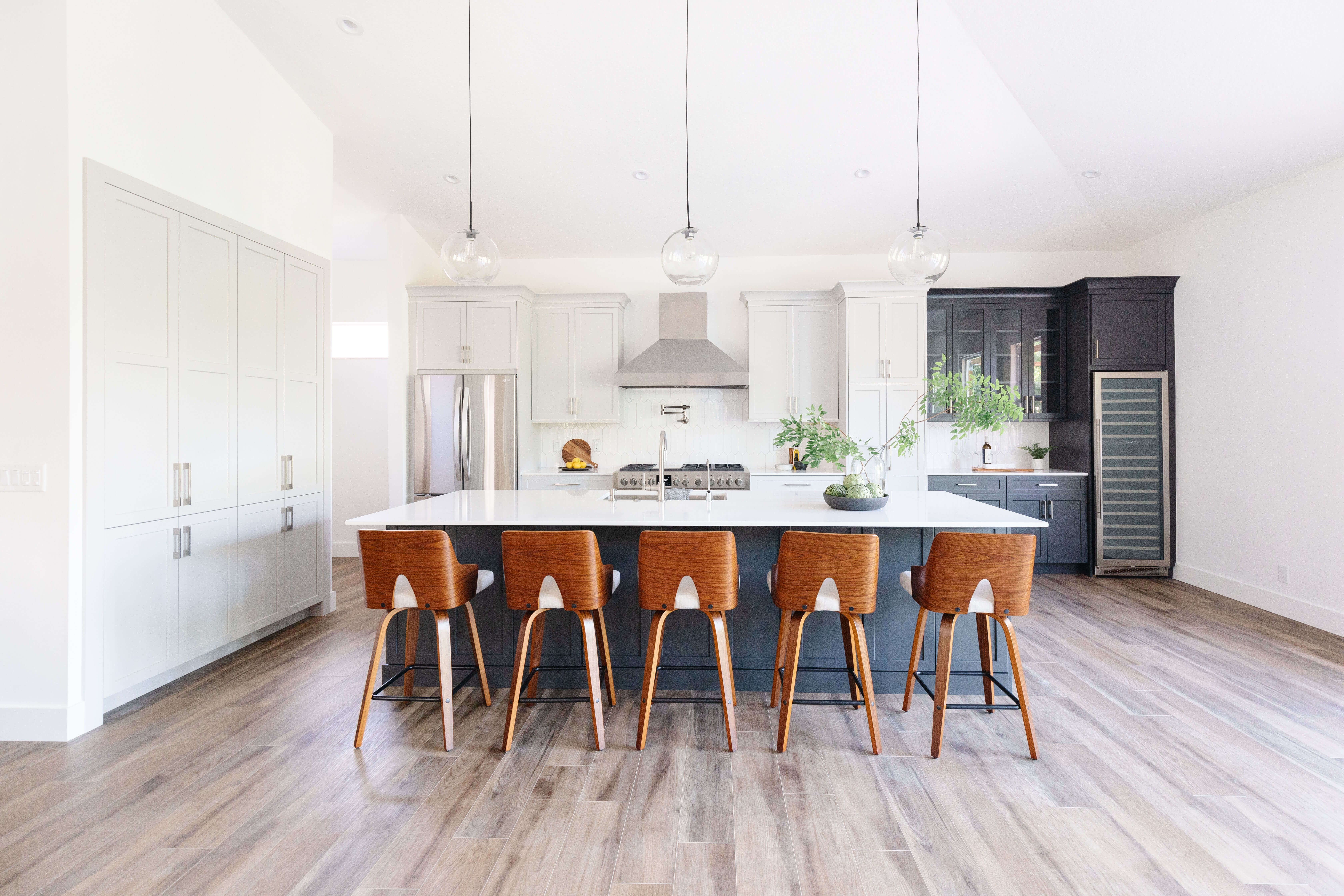
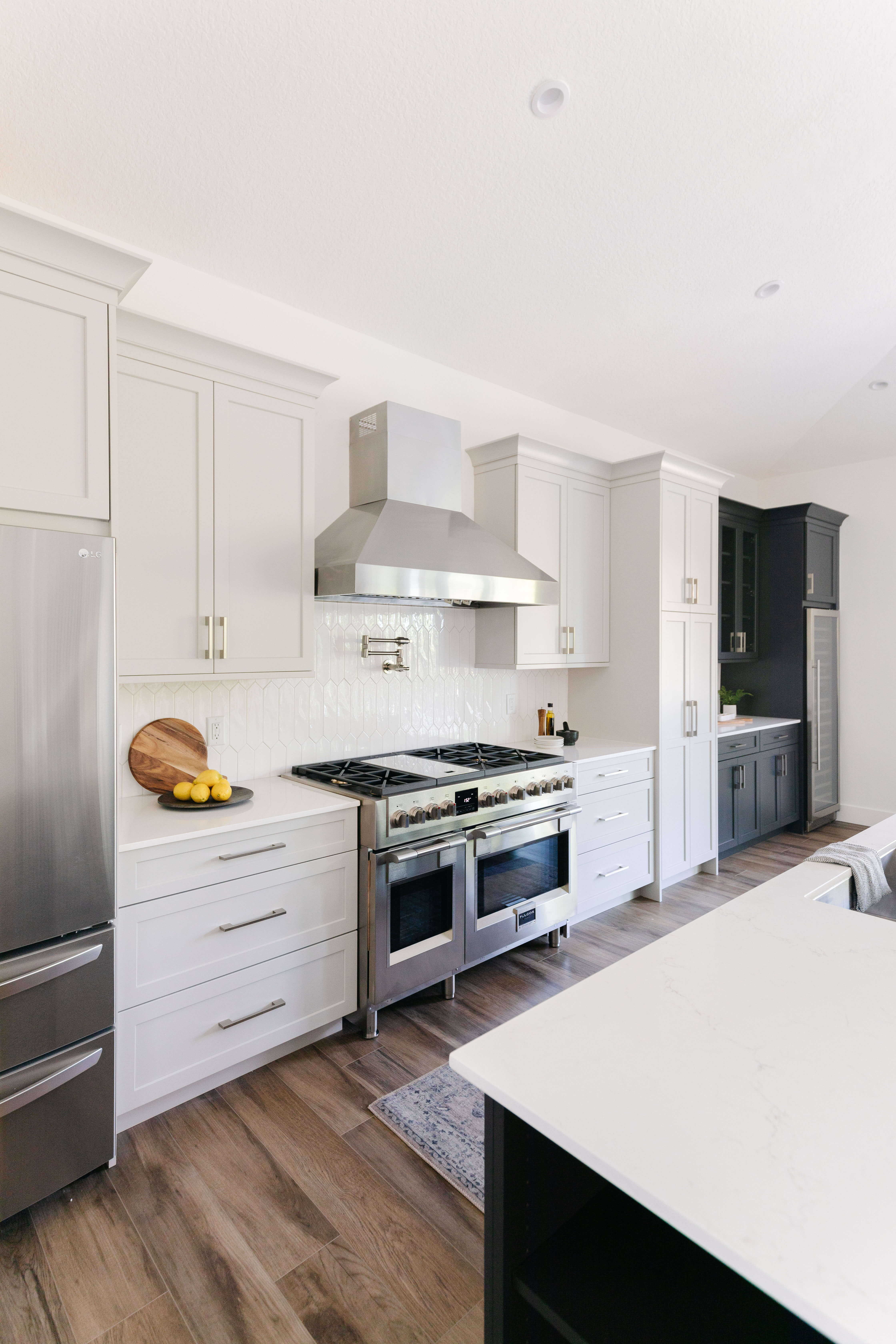
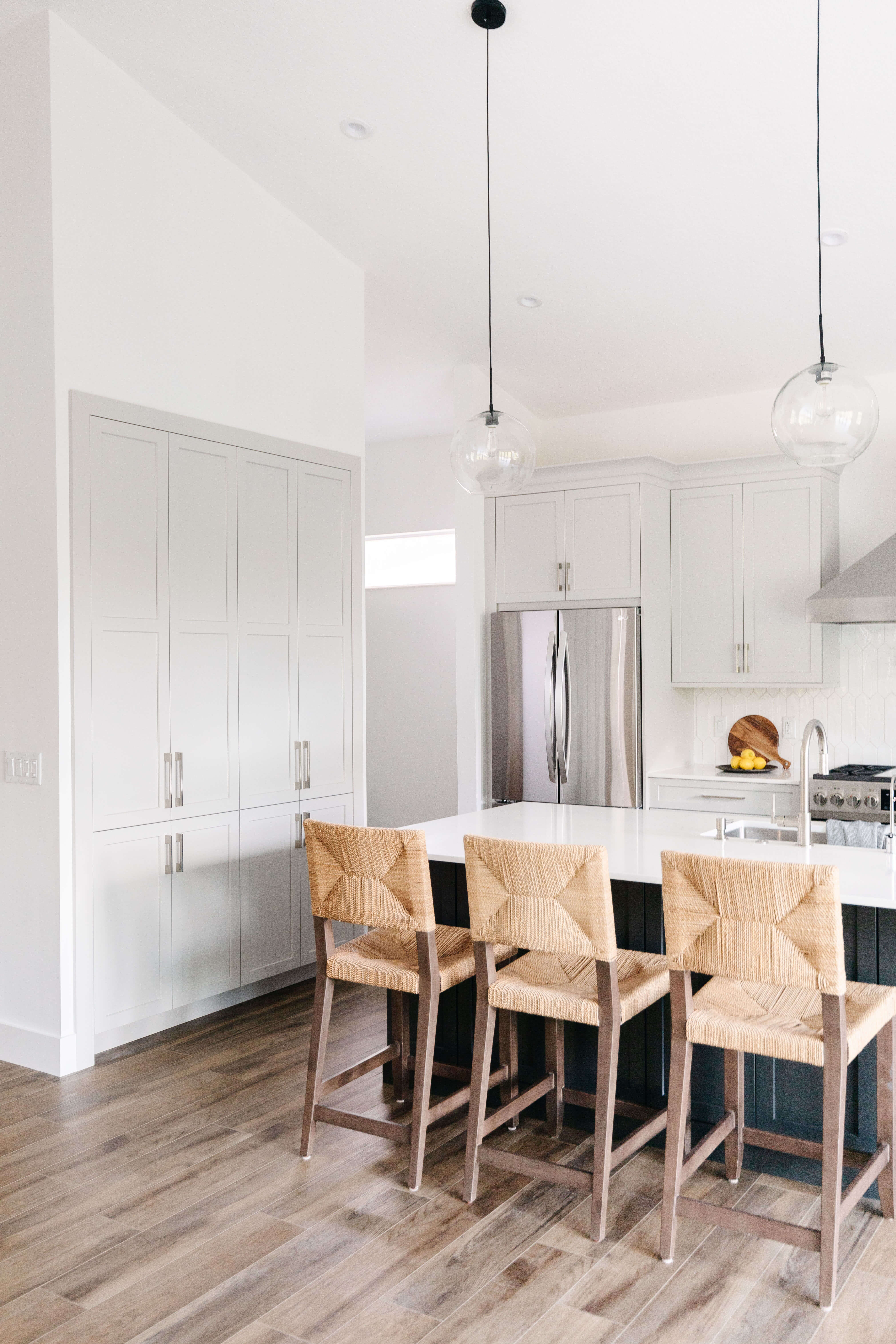
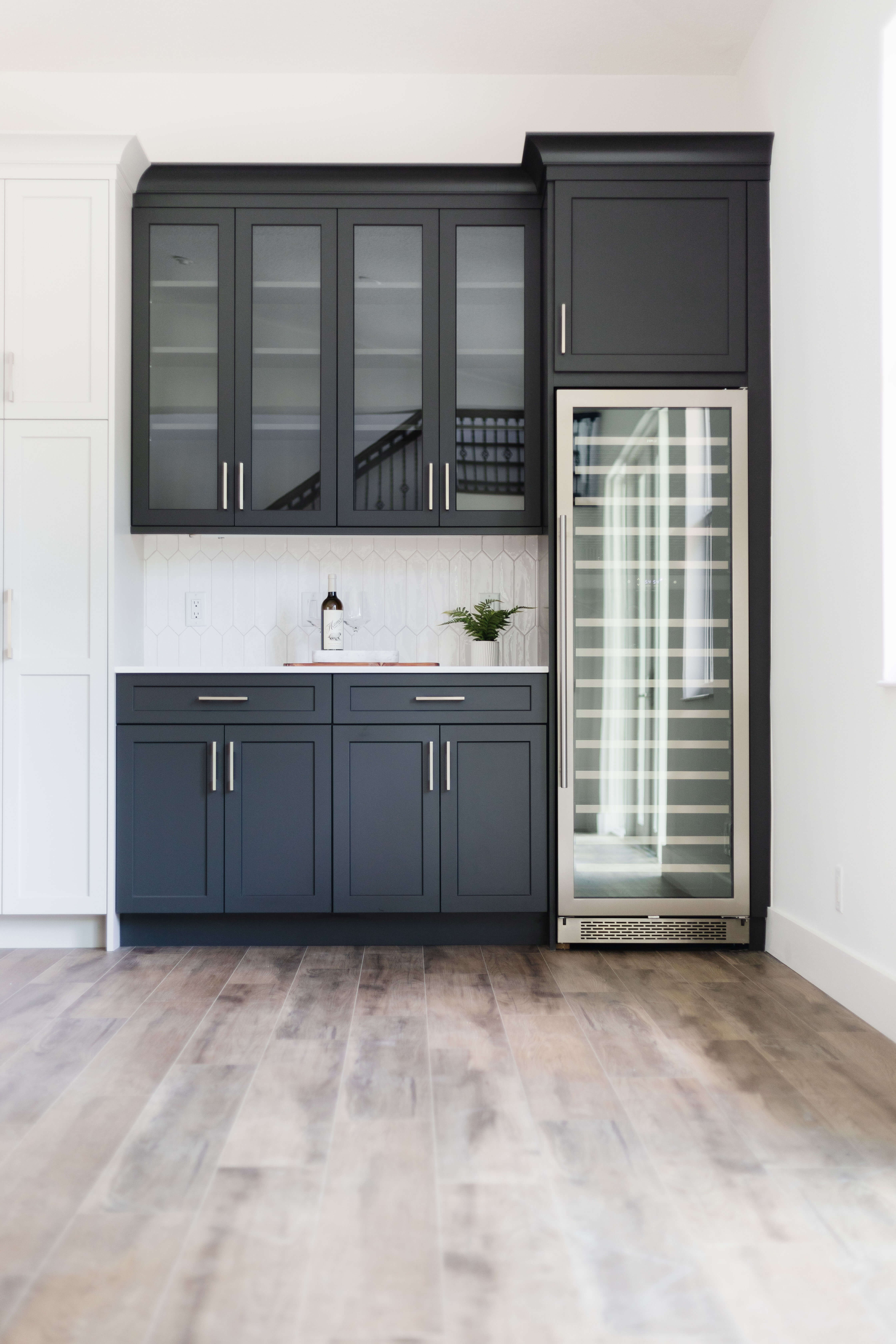
The designer created a two-tone look using Dura Supreme’s “Pearl” paint for the perimeter, a soft off-white, gray paint color paired with the “Graphite” paint, an almost black color, for the kitchen island and beverage center.
The new location and layout not only deliver a ton of natural light, but it’s larger and packed with storage and functionality.
To create a kitchen that is easy to entertain in, Bianca created a dedicated beverage station to the side of the kitchen so that the host can work away in the kitchen while guests can grab a beverage without crossing paths. The separated counter space creates an extra workspace as well as a beautiful location to display a spread of food for a party. Highlighting the area with a contrasting dark gray color not only adds an eye-catching element to the design, but also highlights the area for guests to quickly spot the area.
The addition of a grand kitchen island with seating for five also makes it easy to entertain their guests while prepping a meal.
A Mid-century Modern Master Bathroom Sanctuary
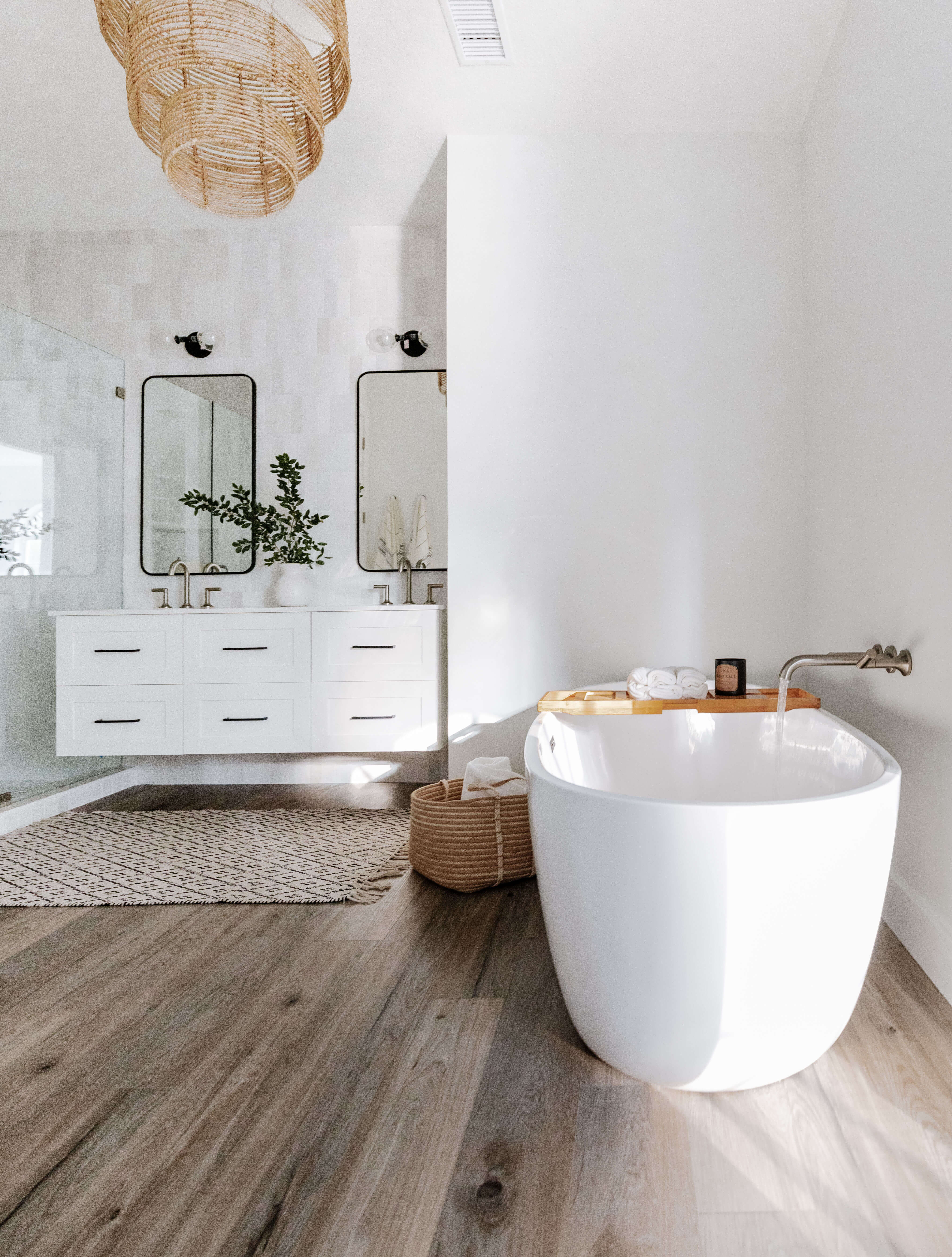
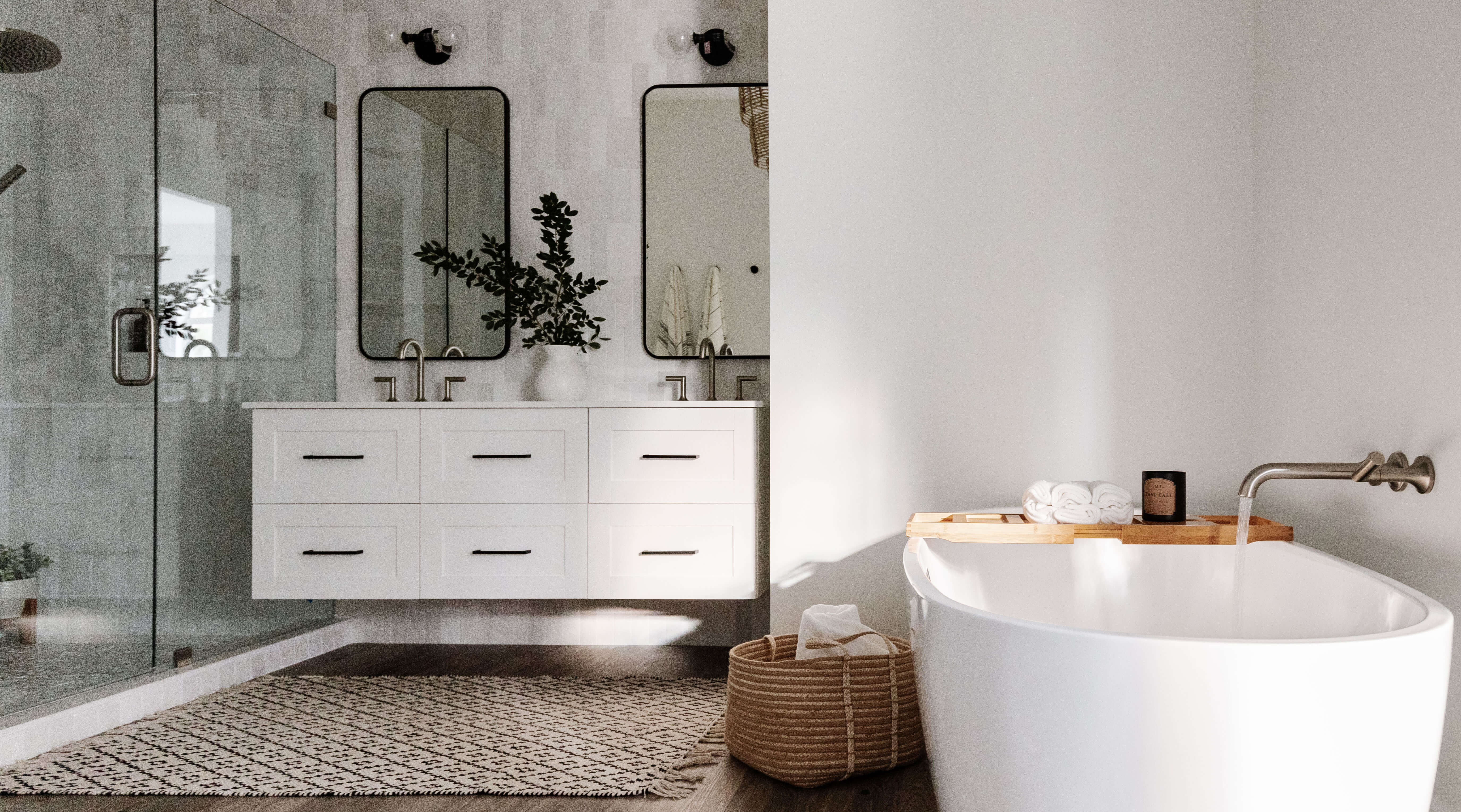
The master bathroom was also in dire need of renovation. The homeowners felt the old space felt dark, unorganized, and small. Bianca suggested a white-on-white color palette with small accents of Black. This helps keep the room cohesive with the new kitchen design but with the focus on being primarily white, the room feels spacious and fresh.
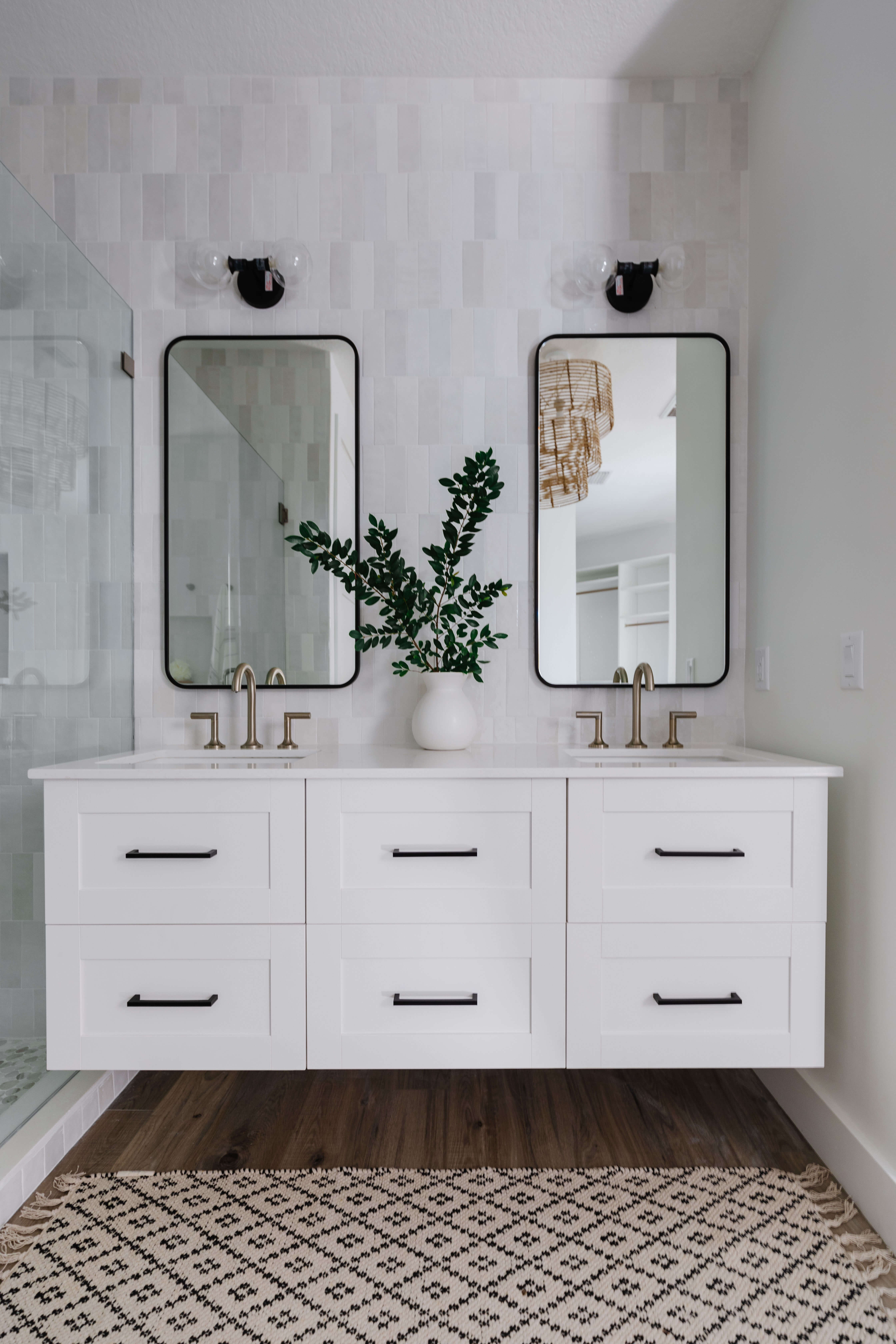
A “White” painted floating Dura Supreme vanity was used to expose more of the floor space to add to the feeling of a larger room while also emphasizing the Mid-Century Modern look the homeowners were dreaming of.
The Dura Supreme floating vanity is shown in “White” paint on the Hudson cabinet door style.
Everything Came Together Magically
The new open floor plan makes it so much easier and more enjoyable for the couple to do their day-to-day routines and entertain guests. “I felt blessed when our clients invited us over for a cheese & wine party after the renovation. Seeing the final design live-in-action felt like magic. You could tell they completely loved their new space,” shared Bianca.
The transformation of this kitchen & bathroom is magical! The designer granted all the wishes on the couple’s wish list and then some.

